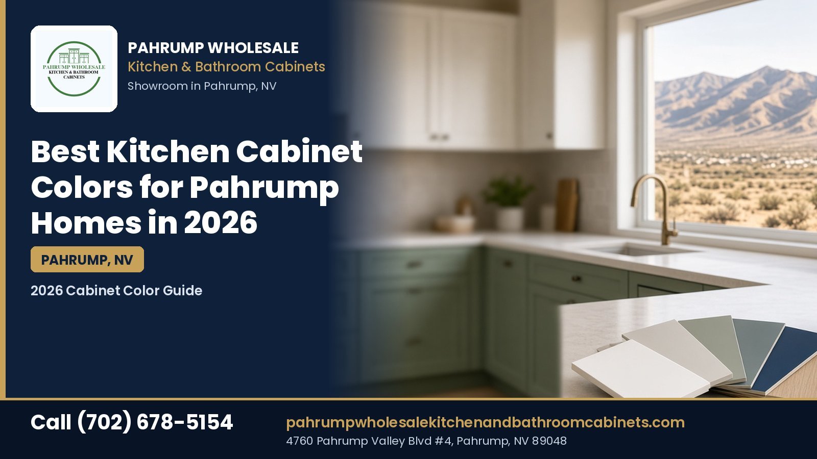
Pahrump Wholesale Kitchen and Bathroom Cabinets · 2026 Cabinet Color Guide
Best Kitchen Cabinet Colors for Pahrump Homes in 2026
Picking a cabinet color looks easy until you hold a small door sample in a Pahrump kitchen at two in the afternoon. The desert sun pours in, the white you loved in a catalog turns blue or yellow, and the dark navy that looked rich online suddenly shows every speck of dust. The best kitchen cabinet colors Pahrump homeowners can choose in 2026 are the ones that hold up to strong light, fine dust, dry air, and hard water, while still matching the floors, counters, and home style you already have. This guide skips the hype and gives you a way to decide. You will learn how bright desert light shifts color, which color families make sense in 2026 and why, how finish and material change the result, how to hide everyday wear, how to coordinate with countertops and hardware, how to test samples before you order, and how to think about resale and rentals. Visit Pahrump Wholesale Kitchen and Bathroom Cabinets at 4760 Pahrump Valley Blvd #4, Pahrump, NV 89048, or call (702) 678-5154.
What are the best kitchen cabinet colors for Pahrump homes in 2026?
For most Pahrump kitchens in 2026, the safest strong choices are warm whites and soft creams, greige and mushroom neutrals, muted sage or olive greens, natural and light wood tones, and deep blue or charcoal used on an island or lower cabinets. Warm, slightly muted colors handle bright desert light and dust better than stark white or glossy black. The right pick depends on your light, floors, counters, and how long you plan to stay.
This page shares general design guidance and educational ranges based on typical residential work, not a price list and not a list of colors in stock at Pahrump Wholesale Kitchen and Bathroom Cabinets. Door colors, finishes, and lines change, so always confirm what is currently available before you plan around a specific shade.
Local context: Pahrump Wholesale Kitchen and Bathroom Cabinets sells kitchen and bathroom cabinets to homeowners across Pahrump and Nye County. To see door colors in person, call (702) 678-5154 or find the showroom on Google Maps and ask which colors and finishes are available right now.
How to Choose a Kitchen Cabinet Color for a Pahrump Home
Quick answer: Start with what will not change: your floors, your countertops if you are keeping them, the direction your windows face, and the style of the house. Then pick a color family that works with those fixed pieces, choose a finish that suits how hard you use the kitchen, and test real door samples in your own light at different times of day before you order.
Most color regret comes from choosing in the wrong order. People fall for a color on a phone screen, order cabinets, and only then discover that it fights the floor tile they have no plans to replace. A better approach is to treat cabinets as one layer in a room that already has rules. The cabinets are usually the largest block of color in the kitchen, so they set the mood, but they have to get along with everything around them.
Step 1: List the fixed elements
Walk through the kitchen and write down every surface that is staying. In many Pahrump homes that list includes tile or vinyl plank flooring, a stone or laminate countertop, the color of the walls in adjoining rooms, window trim, and the finish on appliances. Note the undertone of each one. Is the floor tile pinkish beige, yellow beige, or gray? Does the granite have gold, rust, or blue flecks? Are the appliances stainless, black, or white? Undertones matter more than the main color, because two “beige” items with different undertones can make each other look dirty.
Step 2: Read your light
Next, notice where the light comes from. A kitchen with a big west-facing window gets intense, warm late-day sun. A kitchen facing north gets cooler, steadier light. A room with a small window and a covered patio may feel dim even at noon. The same cabinet color behaves differently in each case, which is why the next section focuses on light in detail.
Step 3: Decide how bold you want to be
Be honest about how long you plan to live in the home and how much you like change. If you might sell in a few years, a broadly appealing neutral on the main run with a bolder island keeps options open. If this is your long-term home and you love green, there is no rule against a green kitchen. The goal is a color you will still like on an ordinary Tuesday morning five years from now, not just on the day the cabinets go in.
Step 4: Pick the finish with the color
Color and finish are one decision, not two. A creamy white in a smooth painted finish, a white thermofoil door, and a white laminate slab can look quite different and age differently. Decide on the door material and sheen at the same time as the shade. The finish section below explains the trade-offs.
Step 5: Test before you commit
Finally, look at real door samples, not paint chips, inside your kitchen. A full-size door or a large sample shows how the color reads across a broad surface and next to your counter and floor. The sampling section later in this guide walks through a simple test plan.
If you are still choosing a door style, read the guide to cabinet styles for Pahrump homes first, because a color that looks great on a Shaker door can look different on a flat slab.
How Pahrump Sun and Light Change Cabinet Colors
Quick answer: Strong, clear desert sunlight washes out pale colors, exaggerates undertones, and makes glossy finishes glare. Warm whites, soft neutrals, and muted colors usually look calmer in bright Pahrump light than stark cool whites or high-gloss dark colors. Kitchens with west-facing windows need the most testing, because afternoon sun is both intense and warm.
Pahrump sits in the Mojave Desert, with long sunny stretches, very low humidity, and hot summers. The National Weather Service climate summary for the Las Vegas area describes the region’s abundant sunshine and dry air, and Pahrump’s valley sees similar conditions. That climate affects color in a few predictable ways.
Bright light flattens pale colors
When strong sun hits a pale cabinet, the subtle differences between whites and creams shrink. A soft white with a hint of warmth may read as plain white at noon and as a gentle cream in the evening. Very cool whites with blue or gray undertones can look sharp, even clinical, in that glare. That is one reason many designers lean toward whites with a little warmth for sunny rooms. They hold their character instead of going stark.
Undertones get louder
Desert light can make undertones jump out. A greige with a green undertone may look olive in direct sun. A gray with a blue base may suddenly feel cold next to warm tile. Before you choose, hold a sample against the floor and counter in full light and in shade. If the cabinet looks like it belongs in a different room, the undertones are fighting.
Window direction makes a big difference
- West-facing: Very bright, warm light in the afternoon. Warm colors can turn orange, and whites can glare. Muted mid-tones, soft greens, and warm whites with low sheen often work well.
- South-facing: Strong light most of the day. Most colors look bright and true. Dark lower cabinets can balance the brightness.
- East-facing: Bright, warm mornings and cooler afternoons. Test samples at breakfast and dinner time.
- North-facing: Cooler, softer, more even light. Warm whites, creams, and wood tones help the room feel welcoming. Cool grays can feel flat.
Sheen and glare
Glossy surfaces bounce sunlight straight back at you. In a sunny kitchen, a high-gloss slab door can create bright hot spots and show fingerprints and dust clearly. Matte and satin finishes soften glare and hide small marks, though very flat finishes can be harder to wipe clean. For most busy Pahrump kitchens, a satin or low-sheen finish is a practical middle ground.
Artificial light matters too
After sundown, your bulbs take over. Warm LED lighting, often labeled around 2700K to 3000K, flatters warm whites and wood. Cooler bulbs around 4000K or higher can make the same cabinets look gray or blue. If you are adding under-cabinet lighting, choose the color temperature with the cabinets in mind and keep it consistent across the room.
Sun exposure and fading
Strong UV exposure can change some finishes over time. Natural wood stains may darken or shift toward amber, and some lighter painted or wrapped finishes can yellow slightly near a sunny window. Cabinets in direct sun all afternoon will age differently from those in shade. Simple fixes such as solar shades, UV-filtering window film, or keeping blinds partly closed during peak hours help keep color even.
The 2026 Kitchen Cabinet Color Families Worth Considering
Quick answer: Seven color families make the most sense for Pahrump kitchens in 2026: warm white and cream, greige and mushroom neutrals, muted sage and olive greens, natural and light wood tones, deep navy and inky blues, charcoal and soft black accents, and two-tone combinations. Each one suits specific light and with specific counters and floors.
National design trend pieces for 2026 keep pointing in the same direction: warmer, earthier, and more natural colors, with less cold gray than a decade ago. That shift suits desert homes, where warm earth tones already show up outside every window. Below is a practical look at each family, what it pairs with, and what to watch for. Treat these as starting points to discuss at the showroom, not a promise that any specific shade is in stock.
1. Warm white and cream
White cabinets remain the most requested color in many markets, and the 2026 version is softer and warmer. Think of whites with a hint of yellow, beige, or gray instead of bright cool white. In a sunny Pahrump kitchen, a warm white looks clean without glaring and pairs easily with beige tile, warm wood floors, and most granite and quartz.
- Works well with: Beige or tan tile, warm wood or wood-look plank flooring, white or cream quartz, brass or black hardware.
- Watch for: Whites that look yellow next to bright white quartz, or gray next to creamy tile. Compare samples directly against your counter.
- Wear: Shows grime near handles and on lower doors more than mid-tones. Easy to touch up on painted doors if you keep the matching touch-up kit.
2. Greige, taupe, and mushroom neutrals
Greige blends gray and beige, and mushroom tones lean a little warmer and browner. These colors replaced cool gray as the go-to neutral for many homeowners because they bridge older beige tile and newer white or gray counters. They are forgiving with dust, which matters in Pahrump, and they stay calm in bright light.
- Works well with: Mixed-tone tile, gray-veined quartz, brushed nickel or warm brass hardware, wood-look floors.
- Watch for: Hidden green or purple undertones that show up in afternoon sun. Test in full light.
- Wear: One of the most forgiving families for daily dust and fingerprints.
3. Sage, olive, and muted greens
Green has grown steadily as a cabinet color, and the 2026 version is muted and earthy rather than bright. Soft sage, gray-green, and deeper olive connect nicely with desert plants and mountain views. Green works especially well on lower cabinets or an island with warm white uppers, which keeps the room light while adding personality.
- Works well with: Warm white or creamy counters, natural wood open shelves, brass or bronze hardware, terracotta or warm-neutral tile.
- Watch for: Greens with strong yellow undertones can look sour in west light. Gray-leaning sages are usually safer.
- Wear: Mid-tone greens hide dust and smudges well.
4. Natural and light wood tones
Wood is back in a big way, especially lighter oak looks, warm natural finishes, and wood-grain slab doors. Wood brings warmth that suits desert homes and pairs with almost any paint color on walls. It can be real wood with a clear or stained finish, or a wood-look laminate or textured foil that resists everyday wear.
- Works well with: White, cream, or soft concrete-look counters, black or bronze hardware, white or green painted cabinets in a two-tone plan.
- Watch for: Wood cabinets next to a wood floor of a very different tone can clash. Either match closely or contrast clearly.
- Wear: Grain hides small dings and dust. Real wood may shift tone with sun exposure over the years.
5. Navy and deep blue
Navy remains a popular statement color, especially on islands and lower cabinets. A deep blue paired with white or cream uppers looks crisp and works well with brass or gold-tone hardware. In strong desert light, navy reads rich rather than heavy, as long as the room has enough brightness from windows and counters.
- Works well with: White quartz, warm white uppers, brass hardware, light wood floors.
- Watch for: An all-navy kitchen in a small room with a small window can feel closed in.
- Wear: Shows light-colored dust and dried water spots more than mid-tones. Expect to wipe lower doors more often.
6. Charcoal and soft black
Charcoal and soft black cabinets give a modern, grounded look. They pair well with wood accents and light counters. Many homeowners use them on an island, a bar area, or lower cabinets only, rather than the whole kitchen.
- Works well with: White or light gray counters, warm wood shelves, brushed brass or matte black hardware.
- Watch for: Glossy black in direct sun shows every fingerprint and speck of dust. Choose matte or satin.
- Wear: Dark finishes can absorb more heat in direct sun. Avoid placing very dark wrapped doors right beside the oven or in a hot sunny window if the manufacturer warns about heat.
7. Two-tone combinations
Two-tone kitchens combine a lighter upper color with a deeper lower or island color, or pair painted cabinets with wood. The approach balances light and depth and gives you a way to use a bolder color in a smaller dose. It has its own section below because the details matter.
For a quick look at which colors local homeowners have favored, see the earlier post on popular kitchen cabinet colors in Pahrump remodels. This guide goes deeper into how to choose and test a color for your specific kitchen.
Finish and Material Matter as Much as Color
Quick answer: The same color looks and ages differently on painted wood, painted MDF, stained wood, thermofoil, and laminate. Painted finishes give rich color but can chip, stained wood shows grain and may shift with sun, thermofoil is smooth and easy to clean but can be sensitive to high heat, and laminate is tough and consistent. Pick the material for your household first, then the color within it.
Cabinet buyers often ask for “a white kitchen” and only later learn that white comes in many constructions. The material under the color decides how it looks up close, how it holds up in dry desert air, and how easy it is to repair. Here is how the common options compare.
| Door finish | How color looks | Strengths | Watch for |
|---|---|---|---|
| Painted solid wood | Rich, slightly soft color | Classic look, can be touched up | Hairline cracks at joints as wood moves in dry air |
| Painted MDF | Smooth, even color | Stable panels, fewer joint cracks | Edges can chip; water damage swells MDF |
| Stained wood | Grain shows through | Hides wear, warm look | Tone may shift with sun over years |
| Thermofoil | Uniform, smooth | Easy to wipe, budget friendly | Can lift or bubble near high heat sources |
| Laminate / textured foil | Consistent solid or wood-grain | Scratch and stain resistant | Chipped edges are hard to repair |
Painted cabinets in dry air
Solid wood expands and shrinks as humidity changes. Pahrump’s air is usually very dry, but indoor humidity still swings with swamp coolers, cooking, and seasons. On painted five-piece wood doors, that movement can show as fine hairline cracks where the rails meet the stiles. It is normal wood behavior, not a defect, but it is more visible on dark or very smooth paint. Painted MDF center panels reduce that effect, which is one reason many painted doors combine wood frames with MDF panels or use MDF throughout.
Stain and natural wood
Stained wood shows grain and natural variation, so no two doors look identical. That variation hides small scratches and dust. Lighter natural stains suit 2026 tastes, and they work well in bright desert kitchens. Expect some color change over many years in sunny spots.
Thermofoil and heat
Thermofoil is a vinyl layer heat-formed over an MDF core. It gives a smooth, even color at a lower cost and wipes clean easily. Its main weakness is heat. Doors beside an oven or in a hot sunny window can lift at edges over time if heat shields are not used. Follow the manufacturer’s guidance on oven clearance and heat shields.
Laminate and wood-look foils
Modern laminates and textured foils are popular for slab-style doors in solid colors and realistic wood grains. They resist stains and scratches well and give consistent color from door to door. Chipped edges are the main repair challenge.
Box material and air quality
The color you see sits on top of a cabinet box. Many boxes use plywood or particleboard made with adhesives. In the United States, composite wood products are covered by the EPA formaldehyde emission standards for composite wood products, which grew out of the California Air Resources Board composite wood program. Ask whether the cabinets you are considering carry compliance labels. Industry groups such as the Kitchen Cabinet Manufacturers Association also run certification programs that test finishes and construction. The guide on how to tell if kitchen cabinets are good quality covers box construction in more depth.
Sheen choices
Sheen changes how color reads. Matte finishes look soft and modern and hide small surface marks. Satin is the most common for painted cabinets because it balances cleanability and glare. Semi-gloss and high gloss look sharp and are easy to wipe but show fingerprints and dust, especially in strong sun. Ask to see the same color in more than one sheen if possible.
Dust, Heat, and Hard Water: Cabinet Colors That Hide Everyday Wear
Quick answer: Mid-tone colors such as greige, mushroom, soft sage, and natural wood hide fine desert dust, fingerprints, and hard-water spots better than bright white or very dark glossy finishes. If you love white or navy, choose a low-sheen finish and plan to wipe lower doors and the sink area more often.
Pahrump homes deal with fine dust that drifts in on windy days and settles on every horizontal edge. Many homes also have hard water that leaves white mineral spots where it splashes. Those two facts shape how a cabinet color will look on a normal day, long after the installation photos are taken.
Where dust shows
Dust collects on the top rails of Shaker doors, the tops of wall cabinets, toe kicks, and the flat tops of drawer fronts. On a dark navy or black cabinet, light tan dust shows clearly. On a stark white cabinet, darker grime shows near handles. Mid-tone colors sit closer to the color of the dust itself, so they look tidy longer between cleanings.
Hard water near the sink
The sink base, dishwasher panel, and nearby drawer fronts get splashed often. Hard water dries as white spots and rings. Those spots stand out on deep colors and dark wood stains. On white and light neutral cabinets they are almost invisible. If you want a dark kitchen, consider keeping the sink wall in a lighter tone, or be ready to wipe it down regularly with a soft damp cloth and dry it.
Heat around ovens and sunny windows
Dark colors absorb more heat from direct sun than light colors. In a west-facing window, a very dark door can get noticeably warm on summer afternoons. For painted and laminate finishes this is usually fine, but wrapped finishes such as thermofoil can be more sensitive. Check the manufacturer’s heat guidance for cabinets near ranges and wall ovens, and use heat shields where recommended.
Kids, pets, and busy kitchens
Homes with young children or pets get scuffed lower doors and drawers. Mid-tone colors, wood grain, and textured laminates hide those marks. Very smooth, very dark, or very bright surfaces show them first. A two-tone plan with a forgiving color on the lowers and a lighter color above is a good compromise.
A simple wear-versus-color guide
| Color family | Dust | Fingerprints | Water spots |
|---|---|---|---|
| Bright cool white | Hides light dust | Shows grime at handles | Hides spots |
| Warm white / cream | Hides light dust | Shows some grime | Hides spots |
| Greige / mushroom | Hides well | Hides well | Mostly hides |
| Sage / olive | Hides well | Hides well | Shows some |
| Natural wood | Hides well | Hides well | Shows some on dark stains |
| Navy / deep blue | Shows tan dust | Shows on gloss | Shows clearly |
| Charcoal / black | Shows tan dust | Shows on gloss | Shows clearly |
This is general guidance based on how color and contrast work, not a lab test. Finish, sheen, and how often you clean matter as much as color.
Cleaning habits that keep color looking new
- Dust tops of doors and drawers with a microfiber cloth weekly, more often after windy days.
- Wipe splashes near the sink and dishwasher right away, then dry the surface.
- Use mild soap and water. Avoid abrasive pads and harsh cleaners that can dull painted or wrapped finishes.
- Keep the touch-up kit or matching paint that comes with painted cabinets, and store it away from heat.
- Run the range hood when cooking to reduce grease film that attracts dust.
Coordinating Cabinet Colors With Countertops, Floors, Backsplash, and Hardware
Quick answer: Match undertones, not just colors. Warm cabinets go with warm floors and counters, cool cabinets with cool ones, and neutrals bridge the two. Choose contrast on purpose: either clearly different or closely matched. Hardware finish and backsplash tile are the easiest places to tie everything together.
A cabinet color rarely fails on its own. It fails because it fights something else in the room. The trick is to see the kitchen as a set of layers that share undertones and have a clear plan for contrast.
Floors first
Floors are usually the hardest thing to change. Many Pahrump homes have beige or tan ceramic tile, wood-look vinyl plank, or older sheet vinyl. Beige tile with pink or peach undertones pairs best with warm whites, creams, and warm greige. Cool white or blue-gray cabinets can make that tile look dated. Gray wood-look plank works with cooler whites, greige, navy, and charcoal. Warm wood-look floors pair with almost any cabinet, though wood cabinets should either closely match or clearly contrast with them.
Countertops
If you are keeping countertops, take a sample piece or clear photos to the showroom and hold door samples against the real stone at home. Granite with gold and brown flecks favors cream, warm white, mushroom, and wood. Busy granite usually looks better with a calm solid cabinet. White and gray-veined quartz gives you the widest choice, from warm white to navy to sage. Butcher block and wood-look counters suit painted cabinets in white, green, or blue.
Backsplash
The backsplash sits between cabinets and counters, so it can bridge colors. A simple white or cream tile works with nearly every cabinet color. Patterned or colored tile adds character but narrows your cabinet options. If you want a bold backsplash, keep the cabinets quieter, and the reverse.
Hardware
- Brass and gold tones: Warm and lively on navy, green, white, and wood.
- Matte black: Crisp on white, greige, and wood; can disappear on charcoal.
- Brushed nickel and stainless: Easy match with stainless appliances; cooler feel.
- Bronze: Warm and forgiving; good with cream and wood.
Hardware is one of the easiest pieces to change later, so it is a good place to experiment.
Appliances
Stainless steel goes with almost every color. Black appliances blend into charcoal and navy and stand out on white. White appliances look best with white or cream cabinets. Panel-ready appliances let the cabinet color continue across the dishwasher or refrigerator.
Walls and adjoining rooms
In open-plan homes the kitchen shares walls with the living and dining areas. Pull a color from those rooms into the cabinet choice, or keep the cabinets neutral so the wall color can change later. Avoid a cabinet color that only works if you repaint the whole house.
The 60-30-10 idea
A simple design rule helps balance a kitchen: about 60 percent main color, 30 percent secondary color, and 10 percent accent. In a kitchen that might mean warm white uppers and walls as the main color, a sage island and lowers as the secondary, and brass hardware and a patterned runner as the accent. It is a guideline, not a law, but it keeps color from getting chaotic.
Two-Tone Kitchens and Accent Islands
Quick answer: A two-tone kitchen usually puts the lighter color on wall cabinets and the deeper color on base cabinets or the island. That keeps the room bright while adding depth, and it lets you use a bolder 2026 color like navy, sage, or charcoal without committing every cabinet to it.
Two-tone layouts are a practical answer to a common problem: you like a bold color but worry it will overwhelm the room or hurt resale. Splitting the color lets you have both.
Common two-tone plans
- Light uppers, dark lowers: Warm white uppers with navy, charcoal, or olive lowers. Bright and grounded.
- Neutral perimeter, colored island: Greige or white around the walls with a green, blue, or wood island. The island becomes the feature.
- Painted plus wood: White or sage painted cabinets with a natural wood island or open shelves. Warm and relaxed.
- Tall cabinets as a block: A pantry wall in one color and the rest in another, used in larger kitchens.
Rules that keep two-tone looking planned
Pick two colors that share an undertone, or one neutral and one color. Keep the hardware the same across both colors unless you have a clear reason to change it. Make the split follow the architecture: uppers versus lowers, island versus perimeter, or one wall versus another. A random mix of colors on neighboring cabinets in the same run tends to look like a mistake.
Ordering two-tone cabinets
Two-tone plans mean two door finishes in one order. Confirm both finishes come in the same door style and construction, check that end panels, fillers, and trim pieces are ordered in the right color for each zone, and ask about lead times for each finish. The guide on how long it takes to order kitchen cabinets in Pahrump explains why different finishes can arrive on different schedules.
Islands in small kitchens
In a compact kitchen, a dark island can feel heavy. A mid-tone such as sage or natural wood gives contrast without shrinking the room. The guide to small kitchen cabinets in Pahrump has more ideas for tight spaces.
Cabinet Colors by Pahrump Home Type
Quick answer: Manufactured and older ranch homes with lower ceilings and smaller windows benefit from warm whites, creams, light wood, and soft greige. Newer builds with open plans and bigger windows can handle navy, sage, charcoal, or two-tone. Rentals do best with durable mid-tone neutrals that hide wear and appeal to many tenants.
Pahrump has a wide mix of housing: manufactured homes, site-built ranch houses from different decades, newer single-story builds, and homes on larger lots with workshops and horse property. The house itself gives clues about which colors will feel natural.
Manufactured homes
Manufactured homes often have lower ceilings, shorter wall cabinets, and narrower kitchens. Light colors help those rooms feel larger. Warm white, cream, soft greige, and light wood are dependable choices. A modest green or blue on the lower cabinets can add character without closing the room in. Check cabinet sizes carefully, because replacement cabinets for manufactured homes sometimes need different heights or depths.
Older ranch homes
Older site-built homes may have original oak cabinets and beige tile. If the tile is staying, warm neutrals and wood tones keep everything in harmony. If you are replacing floors too, you have more freedom. Homes built before 1978 may have lead-based paint on older cabinets or trim, which matters if anyone sands or demolishes painted surfaces. The EPA Renovation, Repair and Painting program explains lead-safe work practices.
Newer single-story builds
Newer homes often have open plans, higher ceilings, bigger windows, and gray or wood-look plank floors. They can handle bolder choices: a navy or charcoal island, sage lowers, or a full wood-grain modern kitchen. Use the view and the light as part of the design, and keep sheen low in rooms with big west windows.
Rentals and investment properties
For rentals, color is about durability, broad appeal, and easy repair. Greige, mushroom, warm white, and wood-look laminates usually make sense. Avoid very dark or very trendy colors that might need replacing between tenants. Consistent colors across multiple units also make repairs and replacements simpler.
Homes with a view
Many Pahrump kitchens look out at the Spring Mountains or open desert. Earthy colors such as sage, olive, warm sand, and natural wood echo that view and make the kitchen feel connected to the landscape.
For the bigger picture on choosing cabinets for different budgets and home types, see the complete 2026 kitchen cabinet buying guide for Pahrump.
Want to See Cabinet Colors in Real Light?
Bring photos of your floors and countertops, a few measurements, and notes on which way your kitchen windows face. Pahrump Wholesale Kitchen and Bathroom Cabinets sells kitchen and bathroom cabinets for homeowners across Pahrump and Nye County. At the showroom you can compare door colors and finishes side by side and ask which options are available right now. Pahrump Wholesale Kitchen and Bathroom Cabinets is at 4760 Pahrump Valley Blvd #4, Pahrump, NV 89048 (Carberry Square).
How to Test Kitchen Cabinet Colors Before You Order
Quick answer: Look at real door samples, not screens or small chips. Hold them against your floor, counter, and backsplash in your kitchen at morning, midday, late afternoon, and night. Compare two or three finalists side by side, check them both vertically and flat, and sleep on the decision before you order.
Screens lie about color. Phone cameras adjust white balance, monitors vary, and catalog photos are lit by professionals. The only reliable test is a real sample in your own room. Here is a simple plan that takes a few days and saves a lot of regret.
Step 1: Narrow to two or three finalists
Use the color family guide above and your notes on floors, counters, and light to narrow your list. Too many choices make the test confusing. Two or three finalists, ideally in the door style you plan to order, is plenty.
Step 2: Get the largest samples you can
Ask whether a sample door, a large finish sample, or a loaner is available. A full door shows how the color reads across a large surface and how the profile catches light. If only small chips are available, look at a display or a full cabinet in the showroom as well, and take photos in daylight near a window.
Step 3: Test at four times of day
- Morning: East light is warm and bright; west kitchens are in shade.
- Midday: Strongest overhead light; colors often look palest.
- Late afternoon: West sun is intense and warm; undertones show.
- Night: Your bulbs take over; check with the lights you will actually use.
Step 4: Test in position
Hold samples vertically where the cabinets will hang, not flat on a table. Place them next to the floor, against the countertop, and under the wall cabinets where shadows fall. Colors look darker in the shade under wall cabinets and lighter on an island in the open.
Step 5: Compare with hardware and backsplash
Set a pull or knob on each sample and lay a backsplash tile next to it. Small pieces change how the whole combination feels.
Step 6: Live with it
Leave the finalists out for a few days. Notice which one you keep looking at and which one starts to bother you. Ask other people in the household. The color that still feels right after a few days is usually the safer choice.
A quick sample log
It helps to write down what you see, because memory of color is poor. A simple log can be a sheet of paper taped inside a cabinet door. For each finalist, note the time of day, whether the sun was hitting the sample, what it sat next to, and one or two words about how it looked: warm, cold, muddy, crisp, too yellow, too gray. After a few days the pattern is usually obvious. One sample will have a string of positive notes, and the others will have the same complaint over and over.
Photos can help, with limits
Photos are useful for comparing samples side by side, but they are not accurate on their own. If you take photos, shoot all finalists in the same frame at the same time so the camera treats them equally. Turn off filters and avoid flash. Use the photos to compare samples to each other, not to judge the true color.
Bring the house to the showroom
If you cannot bring a sample home, bring the house to the sample. Carry a spare floor tile, a countertop offcut or a sample from the fabricator, a backsplash tile, and a pull you like. Showroom lighting is usually even and bright, which is different from your kitchen, so look at the samples near a window if one is available.
Step 7: Confirm the order details
Before you order, confirm the exact color name and finish code, door style, sheen, and that end panels, fillers, toe kicks, crown, and touch-up kits are included in the same finish. Ask whether color can vary between production runs, which matters if you might add cabinets later. The checklist of what to look for before buying new kitchen cabinets covers the rest of the order details.
Planning tools from groups like the National Kitchen and Bath Association can also help you think through layout and design before you settle on color.
Resale, Rentals, and Choosing Colors That Last
Quick answer: If you may sell within a few years, warm white, greige, light wood, and two-tone kitchens with a modest accent color appeal to the widest range of buyers. Bold full-kitchen colors are fine for long-term homes. No color can promise a sale price, so choose based on condition, quality, and how the kitchen feels as a whole.
Color is one of the first things buyers notice in a kitchen, but it is not the only thing. Clean, solid, well-installed cabinets in a calm color usually show better than trendy colors on worn boxes. If resale is part of your plan, think in terms of broad appeal and good condition.
Timeless versus trendy
Trends move. Cool gray dominated for years and now looks dated to many buyers. Warm whites, creams, and wood have come back many times over the decades. Muted greens and navy have stayed popular for a while, especially on islands. Using a trend color on an island or lower cabinets keeps it easy to update later by replacing fewer doors.
What buyers and appraisers notice
Buyers notice whether the kitchen looks clean, updated, and cared for. Chipped paint, peeling thermofoil, water damage, and sagging shelves stand out more than the color choice. The guide on whether new kitchen cabinets improve home value in Pahrump explains why condition and fit matter so much.
Rentals
For rentals, choose colors that are easy to match if a door gets damaged, finishes that resist scratches, and neutral tones that suit many tenants. Wood-look laminates and mid-tone neutrals are common choices for that reason.
Landlords who own several properties often standardize on one or two cabinet colors and one hardware finish. That makes it easier to keep spare doors on hand, simplifies repairs between tenants, and gives every unit a consistent look in listing photos. A forgiving mid-tone on lower cabinets reduces visible scuffs from move-ins and move-outs.
Thinking ten years ahead
Cabinets usually stay in place much longer than paint on the walls. A useful test is to imagine the kitchen ten years from now. Will the color still feel right if you repaint the walls, change the light fixtures, or swap out the hardware? Colors that leave room for other changes tend to age well. Very specific combinations, such as a bright color matched exactly to a patterned tile, can lock the whole room to one moment in design history.
There is no wrong answer if you plan to stay for the long term and love a bold color. The point is to make that choice on purpose, knowing the trade-offs, rather than by accident.
Budget and color
Color can affect price. Some finishes, special paints, two-tone orders, and custom colors may cost more or take longer than standard finishes. As a general pattern, standard white and neutral finishes in stock or ready-to-assemble lines tend to be the most budget friendly, while custom colors on semi-custom or custom cabinets cost more. These are general patterns, not store prices. For educational cost tiers, see the guide to kitchen cabinet costs in Pahrump in 2026, the 10×10 cabinet package cost guide, and the comparison of RTA vs assembled cabinets.
Painting existing cabinets instead
Some homeowners consider painting their existing cabinets a new color instead of replacing them. That can work when the boxes and doors are in good condition. When boxes are damaged or the layout does not work, new cabinets may make more sense. The guide on cabinet refacing vs replacement in Pahrump walks through that decision.
Carrying Cabinet Color Into Bathroom Vanities
Quick answer: Bathroom vanities do not have to match the kitchen, but using the same color family across the home creates a connected look. Wood tones, navy, sage, and warm white all work well on vanities. Choose moisture-tolerant finishes and keep hard-water spots in mind near the sink.
Many homeowners update the kitchen and bathrooms together or in stages. Carrying a color thread from room to room helps the house feel planned. That does not mean every cabinet must be the same color. It means the colors should feel related.
Ideas for connecting rooms
- Use the kitchen island color on the primary bathroom vanity.
- Repeat the kitchen’s hardware finish in bathrooms.
- Use warm white or greige in hall baths and a bolder color in the primary bath.
- Choose a wood vanity to echo a wood island or open shelves.
Bathroom finish tips
Bathrooms see steam and splashes. Water that sits on a vanity edge can damage painted MDF and particleboard. Wipe spills, run the exhaust fan, and seal around sinks. Darker vanities show hard-water spots more clearly, just as in kitchens.
Small bathrooms and light
Many hall bathrooms in Pahrump homes are small with little or no window. In those rooms, light vanities in warm white, cream, or light wood keep the space from feeling cramped. A dark vanity can still work if the walls, floor, and countertop are light, but it will show dust and water spots near the faucet. In a primary bathroom with a larger window, deeper colors such as navy, olive, or a rich wood tone have more room to shine.
Matching countertops and fixtures
Vanity tops are often cultured marble, quartz, or solid surface in white or light neutral colors, which pair with nearly any vanity color. Faucet finish works like cabinet hardware. Matte black, brushed nickel, chrome, and brass each push the look in a different direction. Using the same metal finish in the kitchen and bathrooms helps tie the house together even when cabinet colors differ.
The 2026 bathroom vanities buying guide for Pahrump covers sizes, materials, and layouts in detail.
Common Kitchen Cabinet Color Mistakes in Pahrump Homes
Quick answer: The most common mistakes are choosing from a screen, ignoring undertones in floors and counters, picking a glossy dark finish for a sunny dusty kitchen, mixing too many colors, forgetting trim pieces in the order, and following a trend you will not like in five years.
Most color problems are avoidable with a little testing and planning. Here are the ones that show up again and again.
Choosing from photos only
A color seen online or in a magazine is lit and edited for the photo. In bright Pahrump light it may look completely different. Always test samples at home.
Ignoring undertones
Beige tile with pink undertones next to a cool blue-gray cabinet is a classic clash. Match warm with warm and cool with cool, or use a neutral that bridges them.
Choosing glossy dark finishes in a sunny dusty kitchen
High-gloss black or navy in a bright kitchen shows dust, water spots, and fingerprints all day. If you want dark, choose matte or satin and plan for regular wiping.
Too many colors
Two cabinet colors plus wood is usually the practical limit. More than that tends to look busy unless it is carefully designed.
Forgetting the small pieces
End panels, fillers, crown molding, light rail, toe kicks, and touch-up kits need to match. Missing pieces delay installation and leave mismatched gaps. The kitchen cabinet installation guide lists what to check before installers arrive.
Not planning for adding cabinets later
Colors and finishes can change between production runs or be discontinued. If you might add a pantry or extend a run later, ask about color consistency and consider ordering spare doors or panels.
Following a trend you do not love
A color that is popular this year will not make you happy if it is not your taste. Pick something you like, test it, and make sure it works with the house.
Choosing paint colors for walls first
Wall paint is cheap and easy to change. Cabinets are not. Some homeowners pick a wall color they love and then try to find cabinets to match it, which is backward. Choose the cabinets first, working with floors and counters, and then pick a wall color that supports them. Paint stores can match almost any shade, so the wall will always be the easier piece to adjust.
Ignoring the ceiling and trim
Ceilings and trim are usually white, and that white has its own undertone. A warm cream cabinet next to stark cool white trim can look dingy, while a cool white cabinet next to creamy trim can look gray. Check samples against your trim, and consider repainting trim if it clashes.
The common kitchen cabinet problems guide covers more pitfalls.
Hiring without checking
If you hire someone to install cabinets or paint, check that the person or company holds the right Nevada license for the work. The Nevada State Contractors Board has a license search.
Pahrump Wholesale Kitchen and Bathroom Cabinets
Pahrump Wholesale Kitchen and Bathroom Cabinets sells kitchen and bathroom cabinets to homeowners, landlords, builders, and remodelers across Pahrump and Nye County from its Carberry Square showroom. If you are choosing a cabinet color, bring photos of your floors and counters and notes on your kitchen light, compare door colors and finishes in person, and ask which options are available right now.
- Address: 4760 Pahrump Valley Blvd #4, Pahrump, NV 89048
- Phone: (702) 678-5154
- Email: info@pahrumpwholesalekitchenandbathroomcabinets.com
- Showroom: Pahrump kitchen cabinets showroom
- About: About the store
- Contact: Contact us
- Maps: Google Maps listing
A color that suits your light, floors, counters, and lifestyle is easier to find with samples in hand than with photos on a phone.
Frequently Asked Questions About Kitchen Cabinet Colors in Pahrump
What is the most popular kitchen cabinet color in 2026?
Warm whites and soft creams remain the most widely chosen cabinet colors, but the 2026 direction is warmer and earthier overall. Greige and mushroom neutrals, muted sage and olive greens, natural and light wood tones, and navy or charcoal islands are all common. In Pahrump, warm and slightly muted colors tend to look calmer in strong desert light than stark cool white or glossy black.
Are white kitchen cabinets still a good choice in Pahrump?
Yes, especially warm whites with a hint of cream or beige. They brighten smaller kitchens, suit most floors and countertops, and hide hard-water spots well. Very cool or bright whites can glare in strong afternoon sun and show grime near handles. Choose a satin or low-sheen finish, keep the touch-up kit, and wipe lower doors and the area around the sink regularly.
Which cabinet colors hide dust best?
Mid-tone colors hide fine desert dust best because they sit close to the color of the dust itself. Greige, mushroom, taupe, soft sage, olive, and natural wood grain all look tidy longer between cleanings. Navy, charcoal, and black show light tan dust clearly, especially on the top rails of Shaker doors, and bright white shows darker grime near handles and on lower doors.
Do dark cabinets work in a sunny desert kitchen?
They can, with some planning. Navy, charcoal, and soft black look rich in bright light, especially on an island or lower cabinets with lighter uppers. Choose matte or satin rather than high gloss to cut glare and fingerprints, and expect to wipe off dust and water spots more often. Check the manufacturer’s heat guidance for dark wrapped finishes near ovens or hot sunny windows.
Is green a good kitchen cabinet color for 2026?
Muted greens such as sage, gray-green, and olive are one of the strongest color directions for 2026. They pair well with warm white uppers, natural wood, and brass hardware, and they echo desert plants and mountain views. Gray-leaning greens are usually safer than yellow-leaning ones in strong west light. Green works especially well on lower cabinets or an island if you want a lighter overall room.
How does desert sunlight change how cabinet colors look?
Strong, clear sunlight washes out pale colors, exaggerates undertones, and makes glossy finishes glare. A soft white can look plain white at noon and creamy in the evening, and a greige with a green undertone may look olive in direct sun. West-facing kitchens see the biggest shifts. Test real door samples at morning, midday, late afternoon, and night before ordering.
Should my cabinets match my floors?
They should share undertones, but they do not need to match. Warm beige tile pairs best with warm whites, creams, and warm greige, while gray plank floors suit cooler whites, greige, navy, and charcoal. Wood cabinets next to a wood-look floor should either match closely or contrast clearly. A near match that is slightly off usually looks worse than an intentional contrast.
What is a two-tone kitchen?
A two-tone kitchen uses two cabinet colors, usually a lighter color on wall cabinets and a deeper color on base cabinets or the island. Painted cabinets combined with wood are another common version. Two-tone plans keep a kitchen bright while adding depth, and they let you try a bolder color in a smaller dose. Keep hardware consistent and make the color split follow the room’s layout.
Which cabinet finish is easiest to keep clean?
Smooth laminate, thermofoil, and satin painted finishes are usually the easiest to wipe clean with mild soap and water. Matte finishes hide marks but can hold grime in very flat sheens. High gloss wipes easily but shows every fingerprint and speck of dust in bright light. Avoid abrasive pads and harsh cleaners on any finish, and dry areas around the sink after splashes.
Which cabinet colors are best for resale?
Warm white, greige, light wood, and two-tone kitchens with a modest accent island appeal to the widest range of buyers. Condition matters even more than color, because chipped paint, peeling finishes, and water damage stand out quickly. If you might sell within a few years, put trend colors on an island or lower cabinets, where they are easier to change later.
Should I test cabinet color samples at home?
Yes. Screens and catalog photos are not reliable for color. Ask for the largest sample available, ideally a full door, and hold it vertically next to your floor, countertop, and backsplash. Look at it in morning, midday, late afternoon, and evening light with your own bulbs. Compare two or three finalists side by side and leave them out for a few days before deciding.
Can I order cabinets in more than one color?
Many cabinet lines allow two-tone orders, but confirm details first. Make sure both finishes come in the same door style and construction, that end panels, fillers, crown, and toe kicks are ordered in the right color for each zone, and that lead times work for both finishes. Ask Pahrump Wholesale Kitchen and Bathroom Cabinets which color and finish options are currently available.
Should bathroom vanities match my kitchen cabinets?
They do not need to match, but related colors make a home feel connected. You might repeat the kitchen island color on a primary bath vanity, keep hardware finishes consistent, or use a wood vanity to echo a wood island. Bathrooms see steam and splashes, so choose moisture-tolerant finishes, wipe spills promptly, and run the exhaust fan to protect the vanity.
Where is Pahrump Wholesale Kitchen and Bathroom Cabinets located?
Pahrump Wholesale Kitchen and Bathroom Cabinets is at 4760 Pahrump Valley Blvd #4, Pahrump, NV 89048, in Carberry Square. Call (702) 678-5154 or open the Google Maps listing for directions. The showroom serves Pahrump and nearby Nye County communities, and you can bring photos of your floors and counters to compare door colors and finishes in person. You can also reach the team through the contact page.
Find Pahrump Wholesale Kitchen and Bathroom Cabinets
View Pahrump Wholesale Kitchen and Bathroom Cabinets on Google Maps
Choose a Color That Works in Your Own Light
The best kitchen cabinet color for your Pahrump home is the one that looks right in your light, works with the floors and counters you are keeping, and hides the dust and water spots of daily life. Narrow your list, test real samples at different times of day, and confirm every piece of the order in the same finish. Call Pahrump Wholesale Kitchen and Bathroom Cabinets at (702) 678-5154 with photos of your kitchen, compare door colors and finishes in person, and ask which options are available right now.
4760 Pahrump Valley Blvd #4, Pahrump, NV 89048 · Carberry Square · Serving Pahrump & Nye County